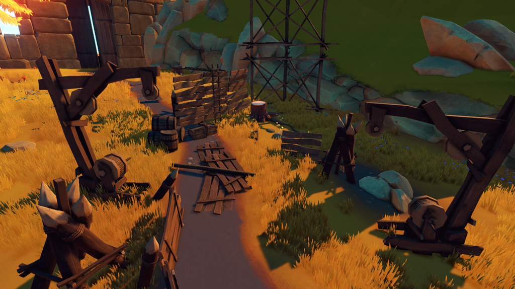
Pichel and Tomé are doing some progress in the texturing department, painting maps for all the modular props. You can see below most of the wooden assets, all game-ready.
Various finished wooden props.
This week André implemented deferred decals, they will be used for blood splats on surfaces and for details in walls/floors, like cracks for example, or other numerous applications in static objects.
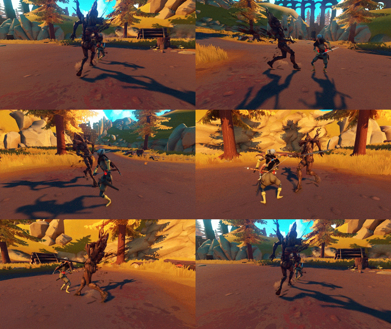
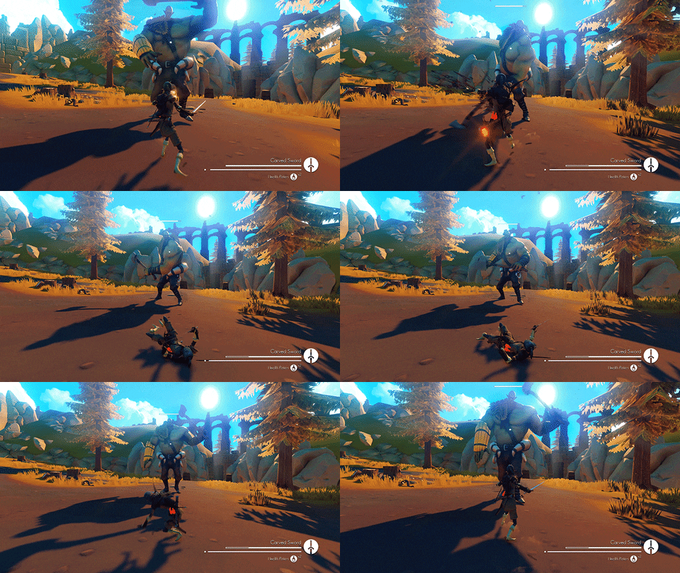
Some improvements have been made in the way enemies respond to hits, like if the player swings the sword in one direction and hits the enemy, he will stagger in the opposite way he was hit. The direction of the blood particle and blood splat in floor respect the hit direction too.
Here you can see some blood on the ground with the new deferred decal system.
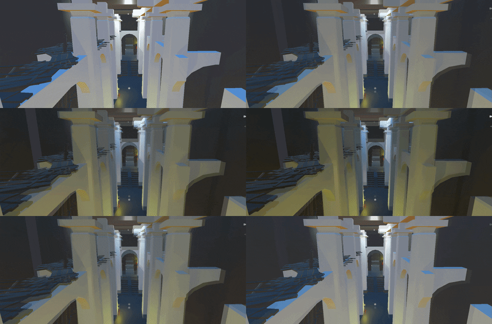
We did some tests with interior lighting too, still very WIP (no final textures nor materials), but now we know that we can achieve cool ambient interiors.
You can see some light coming from the cracked ceiling in the far end.
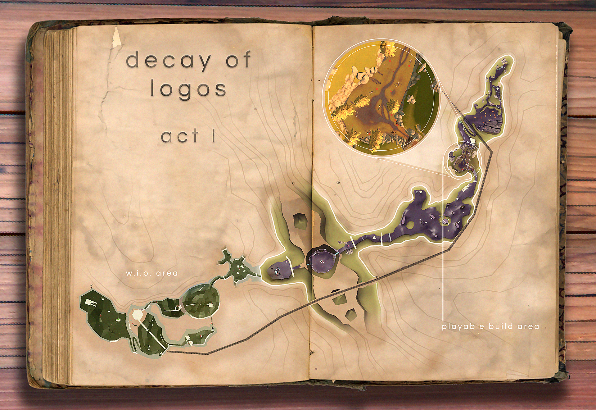
Today we will show you a floor plan preview of the area we are working on which expresses the planned size for the first Act of the game. The areas highlighted with the white contour are the ones we are currently working on. We are building assets to populate every zone fittingly, for example, if it is a predefined dry and rocky space we will not place colorful flowers. In the second Devblog we have shown you guys a mini boss encounter that occurs in the area zoomed in the map below..
Floor plan preview of the first Act.
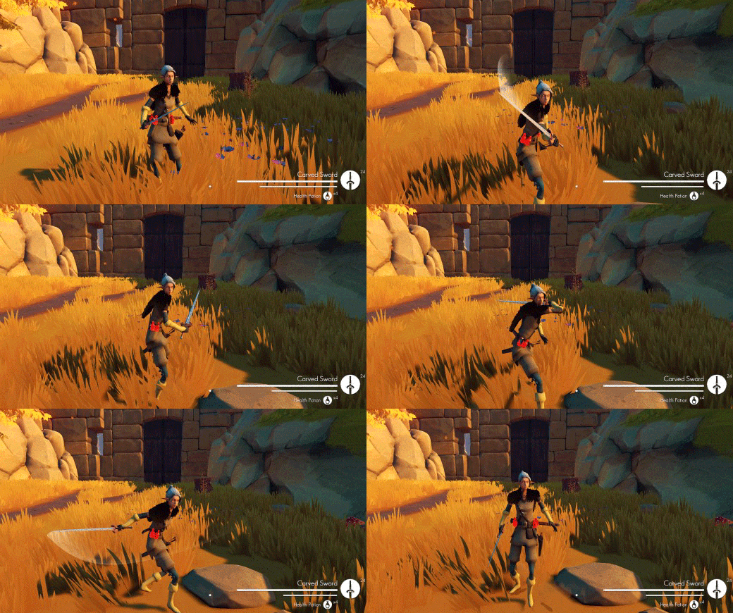
André improved and added more features to combat, like a new trail system (for weapon swipes) and improved bow targeting system. A new Quicksand mechanic was implemented which will have many players trapped when they try to reach some items in isolated zones.
New trail system preview.
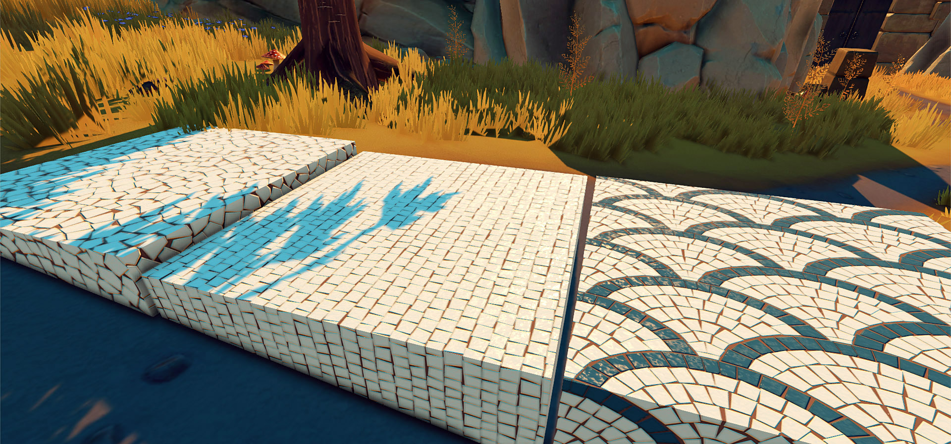
Pichel and Tomé are working on texturing all the assets we have shown in the previous blog post. Here are a few examples of floor tileable textures.
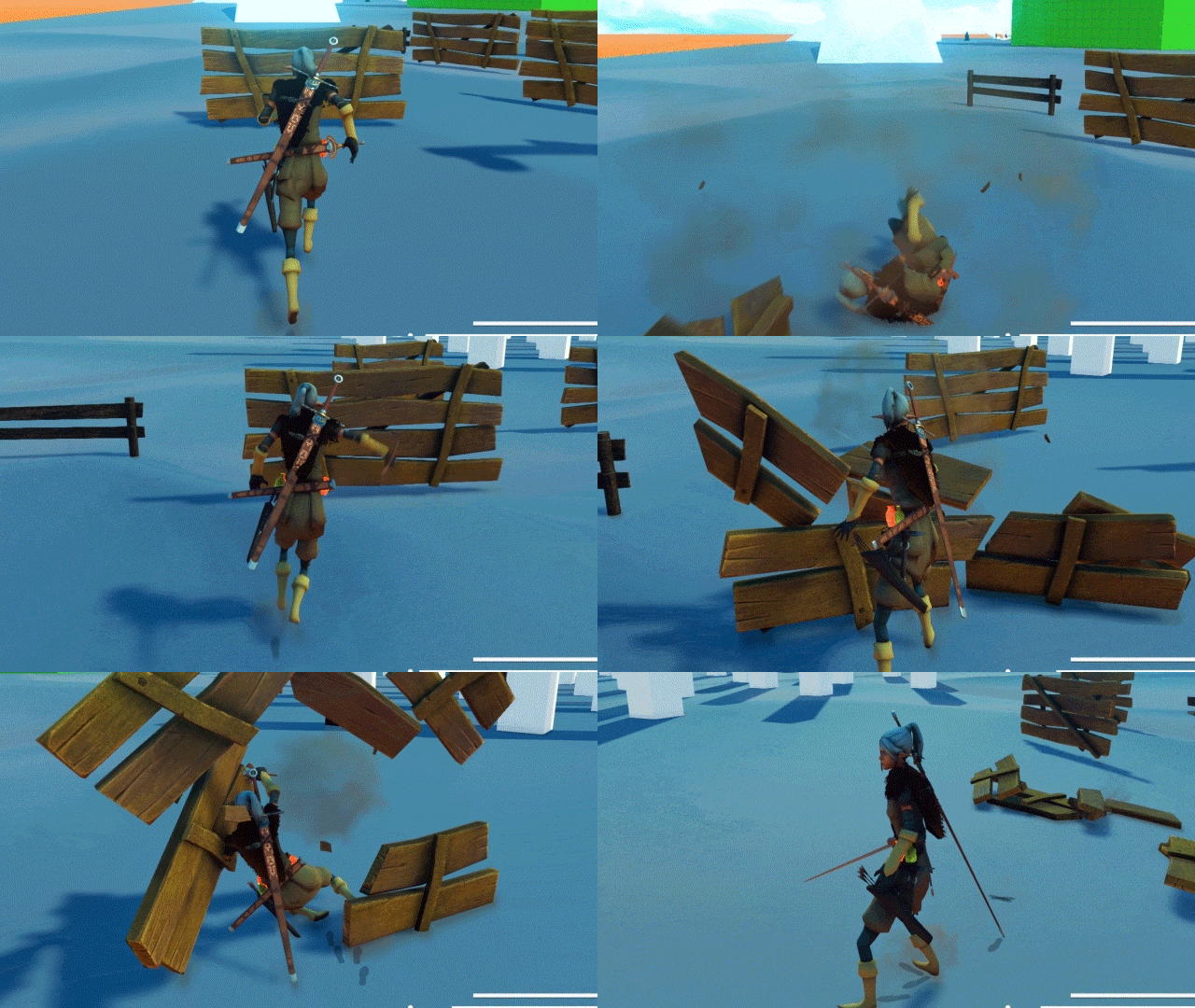
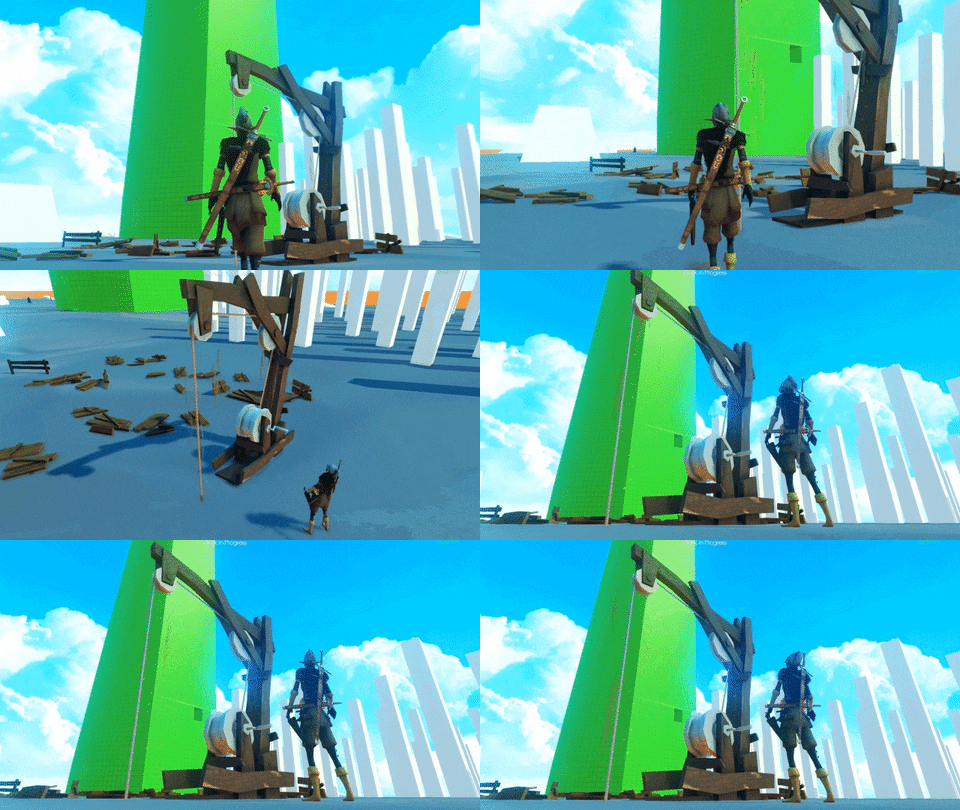
While Pichel and Tomé are finishing the ancient ruins modules and the wooden assets, André is taking up the ones already finished and preparing them for in-game interaction. For example, we now have a breakable wooden fence and a crane!
You can break planks of wood to reach some hidden zones.
WIP model of the wood crane, that can be used to lift up or down objects.
Now, talking about the overall state of the game, all the mechanics logic are done (although we’re mostly still using placeholder objects) and we already did balancing tests with enemies and bosses. The level design of various areas are also done, ready to be populated with the new props. We are working hard to replace the placeholder props and characters, fix bugs and polish the visuals. With more playthroughs we will keep tweaking the gameplay and balance of the game.
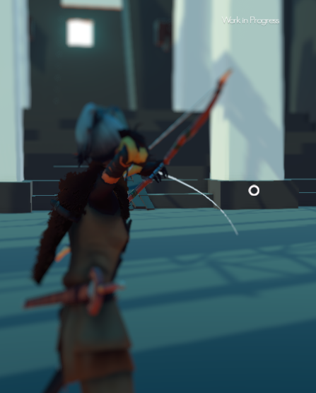
In this week of work, Andre changed some things in the bow behavior. A trail prediction was added and the view when shooting was flipped. We’re also considering removing the Crosshair. In Decay of Logos the range of your bow depends on your Strength Stat.
Old view on the left, current view on the right.
Now the camera goes to the right side instead of left . When locked onto a target the behavior is different (no camera change) and the arrow always hits (if in range and providing the enemy is not defending).
In this screenshot the player has a strength of 11 for example.
Andre started improving the sound in the game and changing some things in how it is handled overall. Audio mixer, duck audio, snapshots and reverb zones were added for a more immersive experience.
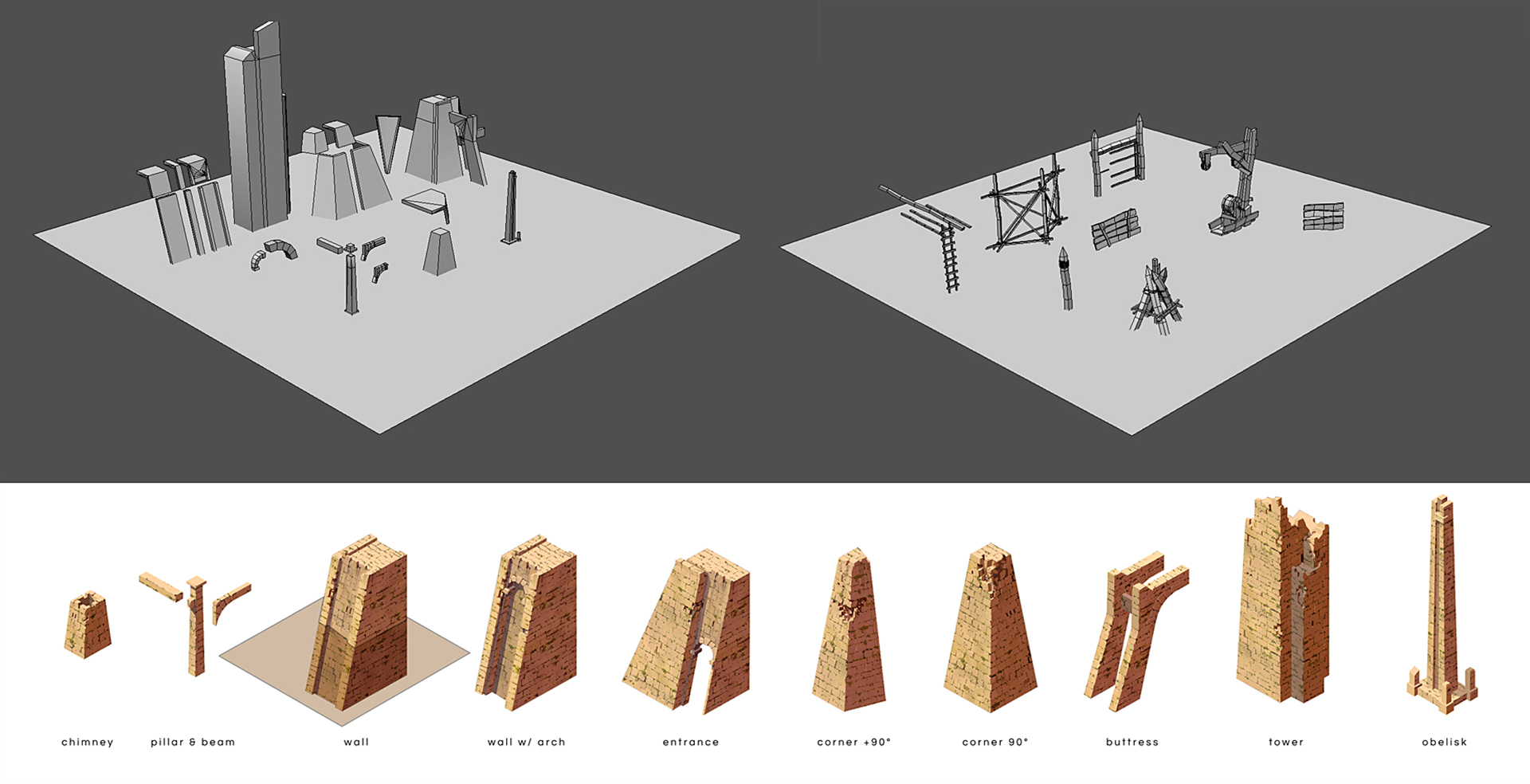
On the other side of the trenches, Pichel and Tomé have been developing our own modular set for the ancient ruins. They’ve been pretty much playing with Lego.
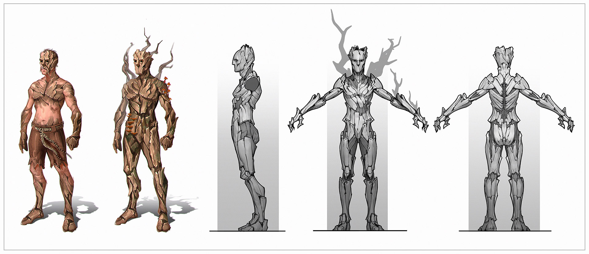
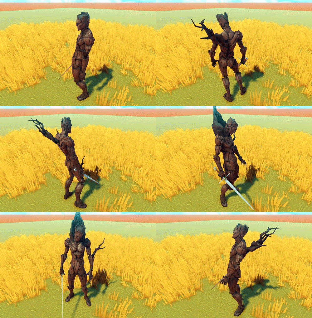
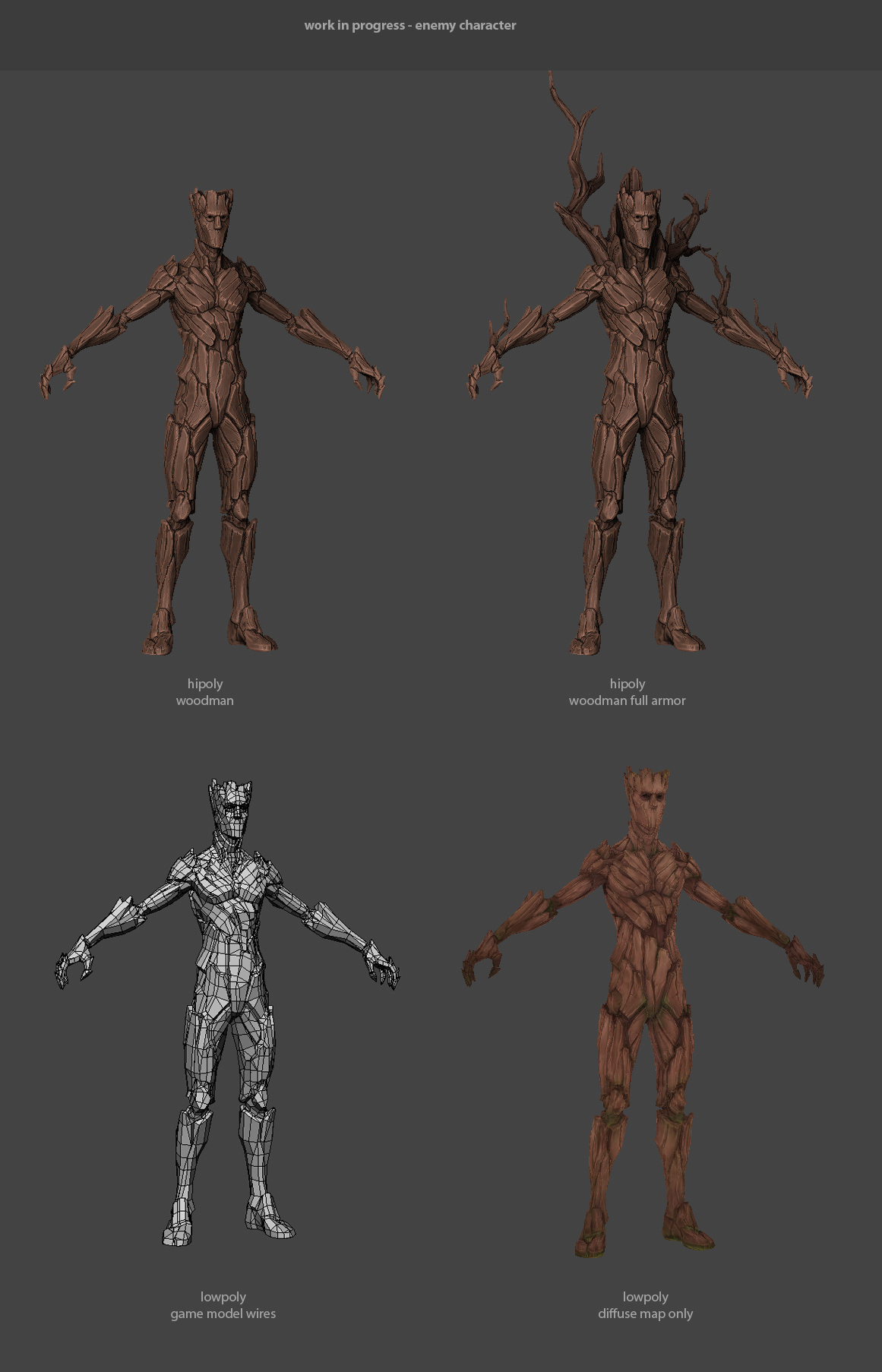
This week we have some character concepts and models to show. It’s the most predominant enemy in the first area of the game.
Concept exploration and orthographic views.
For reasons we won’t spoil, some inhabitants of this world are mysteriously turning into wooden aberrations. The goal of the concept above was to visually establish two phases of this process. In the first iteration, the flesh turning into bark is supposed to be very apparent, while in the second one the body of the villager is already fully transformed. We really wanted it to be clear that these individuals were not always like this, hollow wooden creatures – they used to lead normal lives.
It’s pretty hard not to draw comparisons to the character Groot while designing treelike humanoids, but the way we tried to distance ourselves from that was to stick as close to the human silhouette and anatomy as possible. In essence, the transformation is material, and most of the human form is maintained.
We are a very small team, so we developed a strategy for the enemies to appear and feel different each time the player encounters them.
Most enemies have adaptive AI, and when the enemy is instantiated a Behavior Tree is assigned randomly.
For example, if a Defensive BT (Behavior Tree) is assigned, the enemy will have a shield and act more defensively, going around you and only attacking sometimes. If an aggressive BT is assigned, the enemy will not have a shield and will attack more, and so on.
It terms of visual presentation, randomly instantiated parts will be added to the enemy giving diversity to his silhouette. One interesting thing is that the more attached parts the enemy has, the higher his defense is.
In the past week André was freeing some work for Pichel and Tomé by 3D modeling an area and populating it with props already created. Next step will be texturing the terrain.
High poly and Low poly models.
Pichel was working on the enemy we showed above. UV mapping and low poly is done, and he’s close to finishing the additional parts.
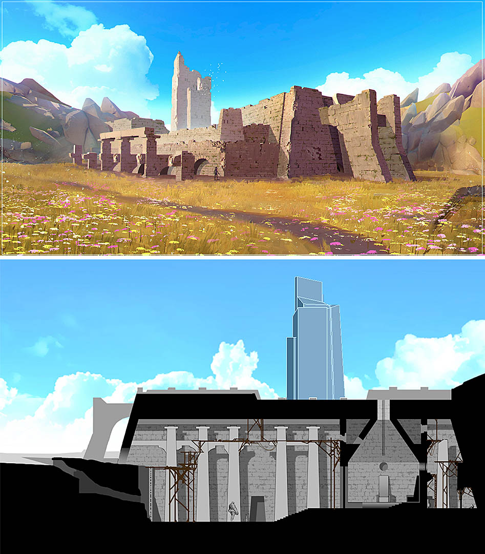
Tomé is working on the 3D modules of the Ancient Ruins we showed in the previous blog post.
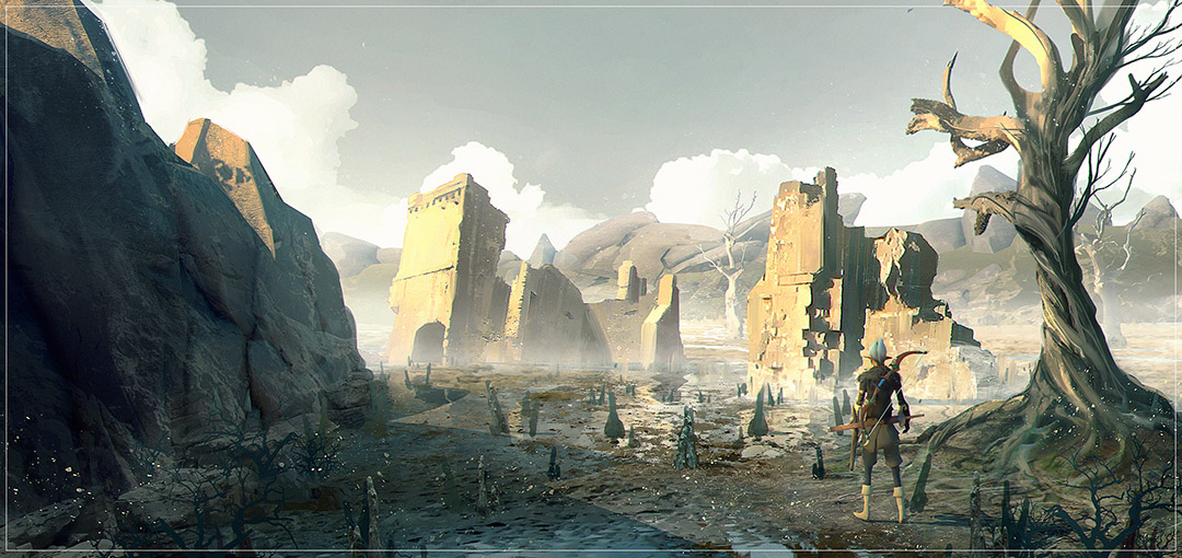
Time for some architectural concepts and new area studies – the game has more than colorful woods! We want to showcase a few additional environments that will be in the game, from very bright and vibrant (like you have seen in previous blog entries) to dark dungeons or windy barren landscapes. The scenery will mirror the player’s mood and experience as they explore our game world.
Tomé, with his architect background has been a great help designing and constructing the ancient ruins that populate part of the world.
Forsaken ruins of an ancient civilization.
We are currently working on other areas like the swamp below while trying to maintain the same stylized look. During their journey players will smoothly transition between different areas, we are going to use the mood as a storytelling device, each area will be unique in it’s own way. It might even be a way to tell the players what kind of challenge they should expect, we are still experimenting and it has been great!
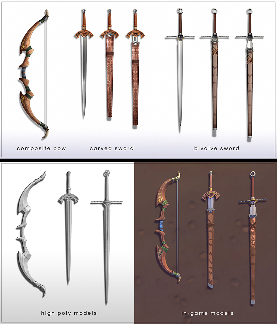
Today we’ll show some concept art and 3D models of the game, most of them are already in-game.
In the beginning of the game you are most likely to find this set of weapons.
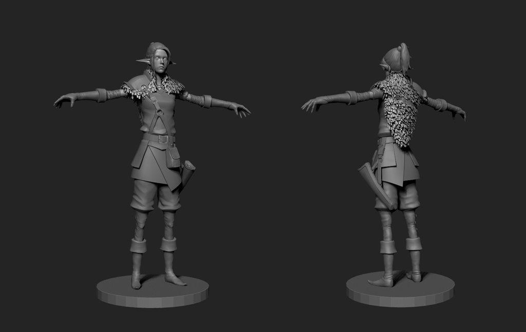
The high poly of the main character.
This week, Tomé did some architectural 3D and concept studies for the ancient ruins which populated the world and in past were once the home of an ancient civilization.
Pichel among other things has been revamping the first enemy you face in the game. We will post some concepts and high poly models in the next devblog post.
André made a small pause in game development and joined the system management dark side. He transferred our cloud solution for project management to our local linux server with Bitbucket Server (VCS), JIRA (project management) and Bamboo (auto-builds) cross integration, plus a robust backup system for our projects. During Pre-production we used Github and Trello.
Finally, we can show you more about the state and development of the game!
Many things changed since the first prototype, the decision to alter the visual style and the growth of the team forced a careful re-thinking of the project as a whole, from the working pipeline, the addition of new mechanics to the rebuilding of some levels and architectural studies.
Revamping the visuals forced us to try some new ideas and concepts until we reached something we could all relate to and we couldn’t be happier with the results.
As mentioned earlier, the team has grown, we now have Filipe Pichel as our art director, a veteran in the area who has worked on various games including titles like Under Siege for PS3. He’s working hard to maintain a consistent and appealing look throughout the game.
Tomé joined us unexpectedly but was a great surprise; he’s very hard-working and talented. An architect turned game developer, he is currently responsible for all the concept art and is also capable of creating high-quality 3d content.
Ricardo Teixeira, during his breaks from Amplify Creations development and customer support, provides us precious help making rigs, testing and implementing workflows and supporting our software pipeline. He is also the bridge between the art and programming team.
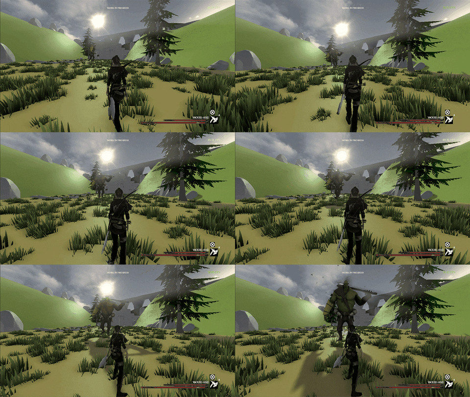
Things have really changed since our first Xbox One preview.
For the first post-prototype milestone we decided to construct a small area and establish the visual style for the first part of the game. It’s a staged encounter with a mini boss that serves as a private playable build where the player can fight him and get a feel for the game with the new graphical style.
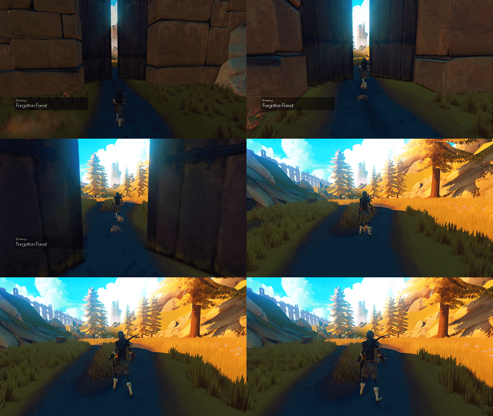
The playable build entry.
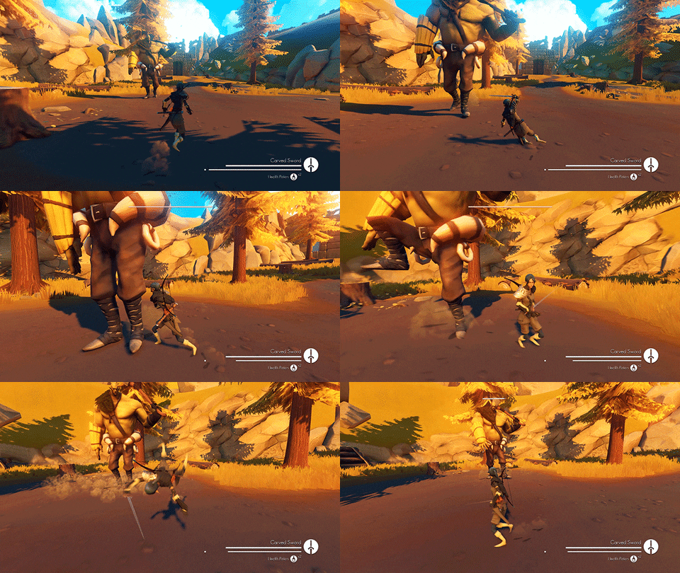
Who is the mysterious Lumberjack? You will learn the hard way when the time comes!.
He might be slow but he has one hell of a swing!
In the upcoming dev blogs we will talk about the game mechanics, lore, concepts, inspirations and some level previews.
Hope you liked the new look we achieved and thanks for reading!
We are starting a development blog for Decay of Logos, our first independent game. It will be available on desktops and consoles, it’s made with Unity and powered by Amplify Creations leading post-processing and texture virtualization tech. We will post as often as possible and we would love to hear from you, feedback and questions are welcome.
Decay of Logos is an immersive action/adventure third-person RPG influenced by Nordic folklore and by J. R. R. Tolkien’s high fantasy. The gameplay is heavily inspired by Dark Souls and The Legend of Zelda, with focus on exploration, combat and resource management. It draws its visual inspiration from movies like Princess Mononoke and games like Shadow of the Colossus.
You play as a girl on a journey with her companion, a mystical Elk. They fatefully meet after her village is destroyed by one of the King’s sons. Battered and oblivious of the culprit behind the attack, the girl will not rest until she has her revenge. During her quest she will unveil secrets about the King and his sons, slowly realizing that all is not what it seems.
André Constantino, our game designer and programmer, started a prototype back in 2014 as a personal project in his spare time. Later that year, he had the chance to demo it at ComicCon Portugal and the reception was great and inspiring.
In 2015, Amplify Creations gave him a chance to have a team by his side, and they are currently working hard together to make Decay of Logos a reality.
Be sure to follow our development blog, Twitter or Facebook.